
Shore Leave Entry: Bungee Jumping
5 posters
Page 1 of 1

Shore Leave Entry: Bungee Jumping
![]() by Gerrard Tue Aug 11, 2009 11:01 pm
by Gerrard Tue Aug 11, 2009 11:01 pm
Was messing around with GIMP and decided to try some things out with my contest entry.
Bungee Jumping
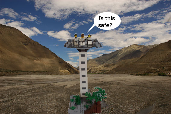
I didn't have the scared face so I did some editing.
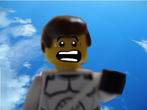
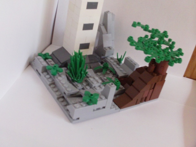
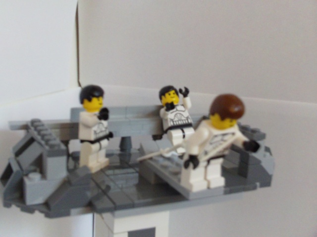
Here are the other images.
Unedited:

 ''
''

Hope you like it!
Bungee Jumping
I didn't have the scared face so I did some editing.
Here are the other images.
Unedited:
''Hope you like it!

Gerrard- Guild Member

- Age : 29
Location : Somewhere to the left of the Death Star

-

Re: Shore Leave Entry: Bungee Jumping
![]() by RubbahBand Tue Aug 11, 2009 11:06 pm
by RubbahBand Tue Aug 11, 2009 11:06 pm
Is this what clones do in there free time? Looks good although I would make the Platform higher up.

RubbahBand- Guild Member
- Age : 27
Location : Haunting CABG
-
Re: Shore Leave Entry: Bungee Jumping
![]() by Gerrard Tue Aug 11, 2009 11:07 pm
by Gerrard Tue Aug 11, 2009 11:07 pm
Yup, that's what the contest is about. 
Gerrard- Guild Member
- Age : 29
Location : Somewhere to the left of the Death Star
-
Re: Shore Leave Entry: Bungee Jumping
![]() by 80-0 Tue Aug 11, 2009 11:15 pm
by 80-0 Tue Aug 11, 2009 11:15 pm
The editing in the second pic looks dreadful. Try and smooth out those edges and not make it look so abrupt.
Also, I always wanted the head on the clone who's jumping back. I think it was only in a few soccer sets which I tried to get and one Drome racing set which I also tried to get. And yes, the platform could stand to be a good twenty feet higher.
Also, I always wanted the head on the clone who's jumping back. I think it was only in a few soccer sets which I tried to get and one Drome racing set which I also tried to get. And yes, the platform could stand to be a good twenty feet higher.

80-0- Non-Guild Member

- Age : 30
Location : New York, New YORK!
Re: Shore Leave Entry: Bungee Jumping
![]() by Luke Tue Aug 11, 2009 11:57 pm
by Luke Tue Aug 11, 2009 11:57 pm
There are gaps between bricks on the top platform and the ground.
It isn't your best work, but the general idea is good.
Good luck in the contest!
It isn't your best work, but the general idea is good.
Good luck in the contest!

Luke- Non-Guild Member
- Age : 28

Re: Shore Leave Entry: Bungee Jumping
![]() by Alpha Wed Aug 12, 2009 12:07 am
by Alpha Wed Aug 12, 2009 12:07 am
The text inside the bubbles looks poor, a bad crop job, terrible backdrop in the latter pictures, too blurry there.
Though it's fine, except for the uneven ground, it looks like you just put plates all over the place, you need to give it some better texture.
Though it's fine, except for the uneven ground, it looks like you just put plates all over the place, you need to give it some better texture.
Alpha- Non-Guild Member
- Age : 28
Re: Shore Leave Entry: Bungee Jumping
![]() by Gerrard Wed Aug 12, 2009 12:19 am
by Gerrard Wed Aug 12, 2009 12:19 am
[AlphA] wrote:
The text inside the bubbles looks poor, a bad crop job, terrible backdrop in the latter pictures, too blurry there.
Though it's fine, except for the uneven ground, it looks like you just put plates all over the place, you need to give it some better texture.
Is there a certain text that is needed?
And I didn't do the editing to perfection I know that, I didn't want it to be perfect. I said I was messing around.
Gerrard- Guild Member
- Age : 29
Location : Somewhere to the left of the Death Star
-
» Shore leave contest entry
» C.J.'s log. Entry #1
» Uh-Oh contest entry
» My bignette entry
» My OH NO! Contest Entry
» C.J.'s log. Entry #1
» Uh-Oh contest entry
» My bignette entry
» My OH NO! Contest Entry
Page 1 of 1
Permissions in this forum:
You cannot reply to topics in this forum|
|
|