HOW TO: Lighting and Staging: Important elements to Builds
+6
Sergeant B
Troopa Daisy
Clonecommando007
^Ninja Trooper^
Rabid Squirrel
eclipsegrafx
10 posters
Page 1 of 1
 HOW TO: Lighting and Staging: Important elements to Builds
I Normally wouldn't write something like this because my skills aren't to where I want them to be but because of the response I got on my Jedi Briefing Room I wanted to some how use the MOC to aid other (new and old) members grow in there building skills. I KNOW I would love to see something like this for ships and mechs, so I decided to walk you through the process of building my MOC.
MOST of it was done within a couple of days but the planning took about 2 weeks or a little more. I first needed to decide on what I wanted to MOC for the new corps announcement. It needed to be jedi centered and I wanted it to portray some canon accuracy, At first I wanted to do the jedi council room but without the round pillars I didn't think it would be as accurate as I wanted it to be so I researched Jedi temple and finally got a picture I liked:

After I decided on the reference picture I then started to pick out the "hard" parts and trouble shoot those areas first versus hitting that wall later on in the building process.
The wall
I first dissected the lighting in the room. I quickly was able to solve this issue with the SNOT technique:

I wanted to capture both the lighting panels and the light from the flooring. If you look at the final you can see it lit up slightly at the bottom.
The Hologram and table
Next came the hard part.... THE HOLOGRAM.... This table posed problems that my primitive building skills could not over take. So what did I do? I asked people who I know were familiar with bricks and have worked on complexed builds. I first contacted Lazerblade because of his battle of mustafar (hopefully i spelt that right. )
)
He lead me to this part:
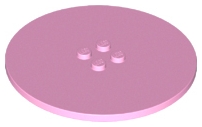
and
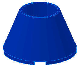
Which I think could have worked great BUT I think it was too simple and one of my previous conversations with legorev was about how he liked to use a new technique or try something different with every build. I wanted to grow my skills with this build as well.
I then contacted lego junkie on flickr who showed me this:

I kind of liked this but when I build it myself I thought it looked kind of primitive and I started to hear TD's voice in my head. Whiney mom voice "eclipse I expected better from you!" and then thought of all the negative feedback it would bring so I quickly went to another builder I admire, Legohaulic and at the same time LegoRev (I smacked my forehead when I didn't contact him first:P). LH had just recently uploaded something that grabbed my attention and thought if anyone could help it could be him.
LegoRev Pointed me to the "donut" technique shown HERE. He also offered several ideas for curving the room (which was another want of mine). Lego Haulic also gave me several ideas as well but what I quickly realized is that I wouldn't be able to do either ideas because of my limited budget and time. I quickly settled on a square room for the build.
Though LegoRev showed me the cool hologram table idea I had yet to figure out how to connect anything to it. I thought it was impossible but I told myself let me build it and see what i can put in and around it.
Once I built it and tested some basic parts I realized I could use it. I placed a Bricklink order for some parts to make the whole thing and waited patiently. As I ordered parts I decided to pick up a few extra parts for the hologram incase it didn't work out the way I wanted since usually things we build don't work out on the first try.
Here is a pictures of the hologram table. I didn't take pictures of it as I made changes (which is a good idea incase you want to go back to an earlier version) but the first few ideas I had didnt work out as well on brick as they did in my head.

The reason for the trans color wedges was to simulate computer lights. I didn't like it and went with light bley wedges instead.
Because I had the tube attached to the orb I had to figure out how to hide it.... hiding it removed my original idea of using a gradual dish sizes to the orb which again turned out great since the large dish was 4x4 and it would look weird holding a 4x4 ball.
Here are some of the glowing light/hologram pictures.

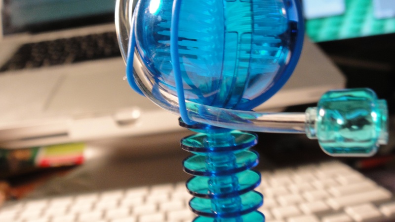 The tubing went through the orb down through the dishes and ALMOST to the base.
Other Revisions
The wall only went through 2 revisions, basically I wanted to see how far apart I wanted the light fixtures to be.
The floor tiling went through one revision as well but it was painful to my nails to remove all the tiles.
Here was the first floor design:

Though it was a little closer to the reference picture (In my opinion) I just didn't have enough tan tiles to stage the photo the way I wanted to. You can also see the fig siting the traditional way wasn't going to work.
The stairs to the right as well only went through 1 revision. I just needed to see how many studs deep I needed to make the steps in order to meet the seats on the left of them at the top.
Here are 2 shots of the wall hologram:
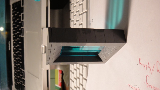
Here is the original, most new members would have stopped here but that is where the mistake lies. Look for ways to add details.

This one had another design I didn't like as much where the studs were on the front and back and were trans light blue.
Staging
Now when designing this MOC my concerns were different then ALL my previous scenes.
Usually I try to do a really nice MOC all around and cram every thing into the picture. Unfortunatly it kills the photography seeing the base plates and the blank sides.
Here it was time to do some staging. I had been following Bantha's MOCs on flickr for some time now and noticed you don't see the edges of his scenes and realized that doing it this way actually brought you INTO the scene. So with this MOC I didn't worry how the outsides looked.
Here are the pictures of the outside of the MOC.
Now that the scene was set we had to worry about proper lighting. I took a few pictures with my room lights off and ONLY haveing the lights on the MOC on to make it look like the lights were coming from inside the MOC. I didn't like the hard shadows and lights and decided it would be best with an ambient light source from the room.

This was with one light on to test how it would shine through the trans plates and how the strong light would shine through the bricks. Also with a flash. No Bueno.
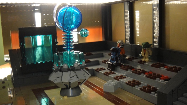
Took the flash off and noticed that the light was showing through the bricks. At this point I started to cut paper and taping it to the back of the bricks to block out the light. This will be shown in the light staging.
Here you can also see light over the ceiling. This was another ceiling version I had where I wanted to have lines of light coming through the top. I quickly abandoned that idea.

No lights on in the room just the ones pertaining to the MOC. It turned out too dark in my opinion.
Light sources and set up

The roof has a 8x8? grill plate where I put the 1x2 trans clear tiles in all the holes in order to properly diffuse the light. If I didn't it would cast the grill shadow on the floor. I also tried a piece of paper but it blocked out too much light. This light source was for the hologram glow.

I used my head lamp that has 9 LED bulbs to light up the hologram. This lamp is normally used for customizing.
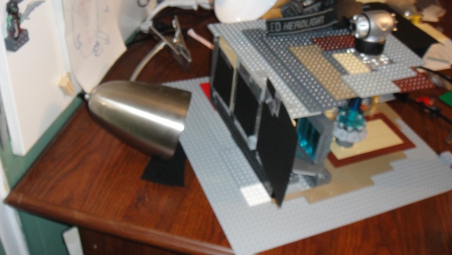
One of my desk lamps I use on my light box was pointed at one side. You will note the taped black pieces of paper.

I did the same with the other side of the MOC.
So as you can see everything had revisions (as it should) in order to get to the finished product. Regardless of how good one part was I always tried to find a better way to set it up.
Even the people sitting took a revision or 2. Sitting the people down like regular minifigs made them look like little kids. I decided to angle some of the legs as well after looking at how the jedi council had there legs when sitting.

This would have been the final but I wanted to iincorporate one of the other Corps MOCs into my MOC to give it more of a story. So with some photo retouching and editing we have the final:

VIOLA!
Well I hope you read through all that and I apologize but I am not used to writing tutorials and stuff like this. Now I appreciate Rooks efforts even more in his tutorials.
Hope this helps someone.
P.S. Sorry for the side ways pictures, not sure why they went up like that but it was too much work as it was to finish this Tutorial for me to go back in and fix each picture. Maybe later.
MOST of it was done within a couple of days but the planning took about 2 weeks or a little more. I first needed to decide on what I wanted to MOC for the new corps announcement. It needed to be jedi centered and I wanted it to portray some canon accuracy, At first I wanted to do the jedi council room but without the round pillars I didn't think it would be as accurate as I wanted it to be so I researched Jedi temple and finally got a picture I liked:

After I decided on the reference picture I then started to pick out the "hard" parts and trouble shoot those areas first versus hitting that wall later on in the building process.
The wall
I first dissected the lighting in the room. I quickly was able to solve this issue with the SNOT technique:

I wanted to capture both the lighting panels and the light from the flooring. If you look at the final you can see it lit up slightly at the bottom.
The Hologram and table
Next came the hard part.... THE HOLOGRAM.... This table posed problems that my primitive building skills could not over take. So what did I do? I asked people who I know were familiar with bricks and have worked on complexed builds. I first contacted Lazerblade because of his battle of mustafar (hopefully i spelt that right.
He lead me to this part:

and

Which I think could have worked great BUT I think it was too simple and one of my previous conversations with legorev was about how he liked to use a new technique or try something different with every build. I wanted to grow my skills with this build as well.
I then contacted lego junkie on flickr who showed me this:

I kind of liked this but when I build it myself I thought it looked kind of primitive and I started to hear TD's voice in my head. Whiney mom voice "eclipse I expected better from you!" and then thought of all the negative feedback it would bring so I quickly went to another builder I admire, Legohaulic and at the same time LegoRev (I smacked my forehead when I didn't contact him first:P). LH had just recently uploaded something that grabbed my attention and thought if anyone could help it could be him.
LegoRev Pointed me to the "donut" technique shown HERE. He also offered several ideas for curving the room (which was another want of mine). Lego Haulic also gave me several ideas as well but what I quickly realized is that I wouldn't be able to do either ideas because of my limited budget and time. I quickly settled on a square room for the build.
Though LegoRev showed me the cool hologram table idea I had yet to figure out how to connect anything to it. I thought it was impossible but I told myself let me build it and see what i can put in and around it.
Once I built it and tested some basic parts I realized I could use it. I placed a Bricklink order for some parts to make the whole thing and waited patiently. As I ordered parts I decided to pick up a few extra parts for the hologram incase it didn't work out the way I wanted since usually things we build don't work out on the first try.
Here is a pictures of the hologram table. I didn't take pictures of it as I made changes (which is a good idea incase you want to go back to an earlier version) but the first few ideas I had didnt work out as well on brick as they did in my head.

The reason for the trans color wedges was to simulate computer lights. I didn't like it and went with light bley wedges instead.
Because I had the tube attached to the orb I had to figure out how to hide it.... hiding it removed my original idea of using a gradual dish sizes to the orb which again turned out great since the large dish was 4x4 and it would look weird holding a 4x4 ball.
Here are some of the glowing light/hologram pictures.

 The tubing went through the orb down through the dishes and ALMOST to the base.
Other Revisions
The wall only went through 2 revisions, basically I wanted to see how far apart I wanted the light fixtures to be.
The floor tiling went through one revision as well but it was painful to my nails to remove all the tiles.
Here was the first floor design:

Though it was a little closer to the reference picture (In my opinion) I just didn't have enough tan tiles to stage the photo the way I wanted to. You can also see the fig siting the traditional way wasn't going to work.
The stairs to the right as well only went through 1 revision. I just needed to see how many studs deep I needed to make the steps in order to meet the seats on the left of them at the top.
Here are 2 shots of the wall hologram:

Here is the original, most new members would have stopped here but that is where the mistake lies. Look for ways to add details.

This one had another design I didn't like as much where the studs were on the front and back and were trans light blue.
Staging
Now when designing this MOC my concerns were different then ALL my previous scenes.
Usually I try to do a really nice MOC all around and cram every thing into the picture. Unfortunatly it kills the photography seeing the base plates and the blank sides.
Here it was time to do some staging. I had been following Bantha's MOCs on flickr for some time now and noticed you don't see the edges of his scenes and realized that doing it this way actually brought you INTO the scene. So with this MOC I didn't worry how the outsides looked.
Here are the pictures of the outside of the MOC.
Now that the scene was set we had to worry about proper lighting. I took a few pictures with my room lights off and ONLY haveing the lights on the MOC on to make it look like the lights were coming from inside the MOC. I didn't like the hard shadows and lights and decided it would be best with an ambient light source from the room.

This was with one light on to test how it would shine through the trans plates and how the strong light would shine through the bricks. Also with a flash. No Bueno.

Took the flash off and noticed that the light was showing through the bricks. At this point I started to cut paper and taping it to the back of the bricks to block out the light. This will be shown in the light staging.
Here you can also see light over the ceiling. This was another ceiling version I had where I wanted to have lines of light coming through the top. I quickly abandoned that idea.

No lights on in the room just the ones pertaining to the MOC. It turned out too dark in my opinion.
Light sources and set up

The roof has a 8x8? grill plate where I put the 1x2 trans clear tiles in all the holes in order to properly diffuse the light. If I didn't it would cast the grill shadow on the floor. I also tried a piece of paper but it blocked out too much light. This light source was for the hologram glow.

I used my head lamp that has 9 LED bulbs to light up the hologram. This lamp is normally used for customizing.

One of my desk lamps I use on my light box was pointed at one side. You will note the taped black pieces of paper.

I did the same with the other side of the MOC.
So as you can see everything had revisions (as it should) in order to get to the finished product. Regardless of how good one part was I always tried to find a better way to set it up.
Even the people sitting took a revision or 2. Sitting the people down like regular minifigs made them look like little kids. I decided to angle some of the legs as well after looking at how the jedi council had there legs when sitting.

This would have been the final but I wanted to iincorporate one of the other Corps MOCs into my MOC to give it more of a story. So with some photo retouching and editing we have the final:

VIOLA!
Well I hope you read through all that and I apologize but I am not used to writing tutorials and stuff like this. Now I appreciate Rooks efforts even more in his tutorials.
Hope this helps someone.
P.S. Sorry for the side ways pictures, not sure why they went up like that but it was too much work as it was to finish this Tutorial for me to go back in and fix each picture. Maybe later.
 Re: HOW TO: Lighting and Staging: Important elements to Builds
I like the lighting technique with the windows the best. I'll have to try that!

Rabid Squirrel- Guild Member

- Location : here

 Re: HOW TO: Lighting and Staging: Important elements to Builds
This topic should be pinned. Great "how to" Eclipes, great techniques! 


^Ninja Trooper^- Guild Member

- Age : 29

 Re: HOW TO: Lighting and Staging: Important elements to Builds
This was a great read, and a good breakdown of an interesting and very well made MOC. Kudos to you on your skill and implementation of this!

Clonecommando007- Kinda like a UFO

- Location : Ohio

 Re: HOW TO: Lighting and Staging: Important elements to Builds
Lolwut? You heard my voice in your head? You haven't even heard me speak before! 
But great tutorial. Great job on dissecting the little bits for us and showing me how to do proper photography!!!

But great tutorial. Great job on dissecting the little bits for us and showing me how to do proper photography!!!


 Re: HOW TO: Lighting and Staging: Important elements to Builds
Wow, you really thought this through Clippy. Great work with the final product, I really liked it. You really have given me some inspiration and taught me a lot throughout this tutorial. The technique for the hologram is just brilliant. 


Sergeant B- Non-Guild Member

- Age : 27
Location : Turn around...

 Re: HOW TO: Lighting and Staging: Important elements to Builds
Wow, it looks like a noob MOC with the improper lighting... 

Jedi Joe- Guild Member

- Location : Florida, the state of neverending heat and humidity...

 Re: HOW TO: Lighting and Staging: Important elements to Builds
WOW! Talk about tutorial!
 Lessons to learn still, we all have.
 Lessons to learn still, we all have.
 Re: HOW TO: Lighting and Staging: Important elements to Builds
Great tutorial, Eclipse. Very helpful, and very useful. 


Knight- VIP Former Staff

- Location : Anywhere with lego.

 Re: HOW TO: Lighting and Staging: Important elements to Builds
DARN! I forgot to give revo credit for the paper behind the bricks idea.
Updated now.
Thanks guys I hope this helps someone with one of their MOCs.
Updated now.
Thanks guys I hope this helps someone with one of their MOCs.
 Re: HOW TO: Lighting and Staging: Important elements to Builds
Wow, that looks amazing. The hologram and the curved elements and the lighting worked perfectly in this scene.
Please do not bump old threads.
~DP
Please do not bump old threads.
~DP

Borgarath-

 Similar topics
» Battle of the swamp.
» The elements meet...
» Lighting test.
» Felucia...Lighting
» World War 2 Tanks, Halftracks, Jeeps...everything.
» The elements meet...
» Lighting test.
» Felucia...Lighting
» World War 2 Tanks, Halftracks, Jeeps...everything.
Page 1 of 1
Permissions in this forum:
You cannot reply to topics in this forum|
|
|


